-
×
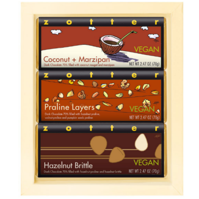 Set "Vegan Nutty" in ivory gift box
- Includes:
Coconut + Marzipan × 1
Praline Layers × 1
Hazelnut Brittle × 1
Zotter 03 ivory gift box × 1
1 × $31.99
Andreas H. Gratze, Zotter’s Art Director, about banana tigers and Pac-Man
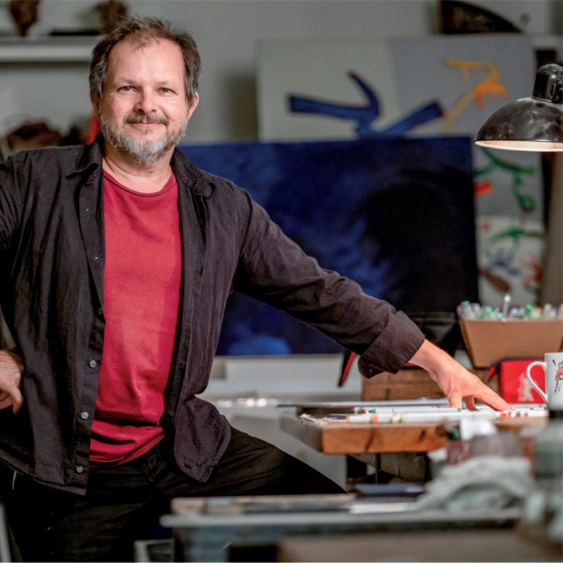
You’ve been creating designs for Zotter since 1994, that’s almost 30 years at this point.
Andreas H. Gratze: We’ve known each other since I was 18. Sepp (Josef Zotter) had his chocolate idea and he needed good package designs. Our friendship has held until this day, surviving my 5-year stint in Vienna and 11 years in Berlin.
For this collection, you’ve actually created more than 50 new designs in the space of just a few months. Where does your inspiration come from?
Andreas H. Gratze: I derive my inspiration from literally everywhere: nature, people, films. The Miso Caramel design came from an Asian movie – a fight scene with protagonists in wide skirts made me think of this particular movement. The Candied Almond design is reminiscent of pebbles I found on a beach in Croatia. And the Fruit Praline & Fragrant Marzipan design comes from a fairy tale with swirling apple pie smell. Kind of like in Tom & Jerry when the mouse floats through the air towards an irresistible cheese smell.
How exactly are the illustrations created?
Andreas H. Gratze: Once I receive Zotter’s list of ideas, I work through it and start on little sketches and copious notes right away. Some things I have to research – like a provenance or some more specific background on a product. Some of the ideas are derived from my own personal sketch book,
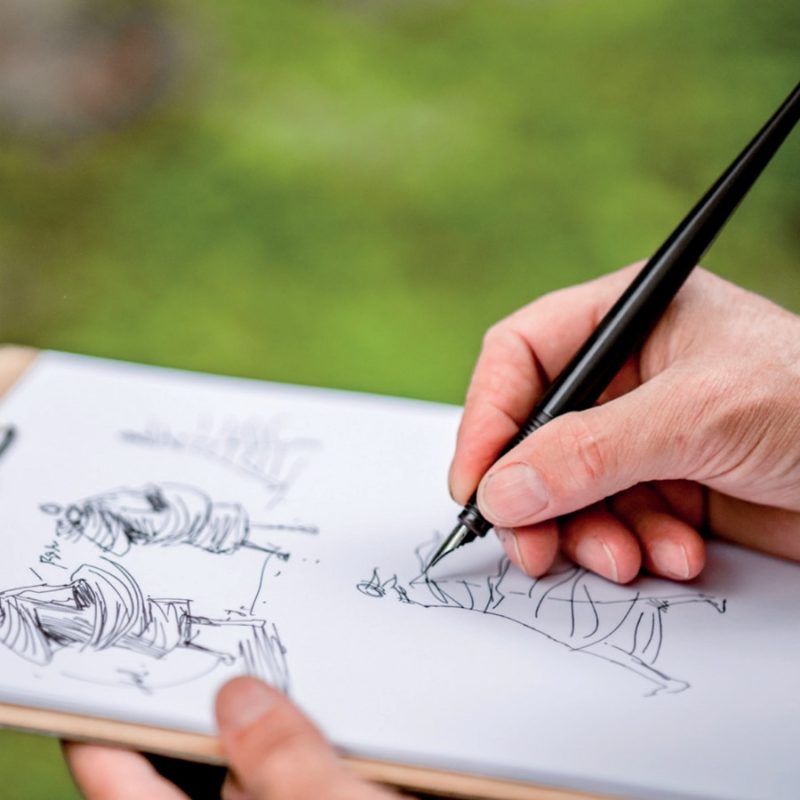
others develop while I draw, for example when I sketch some lemon wedges, I’ll realise all the things I can turn them into, like the Pac-Man lemon. My sketches are all over the place in terms of subject matter. I don’t go down a chronological list but instead create random drawings, developing my designs as I go.
Do you draw on paper?
Andreas H. Gratze: I do, but I use an ink dip pen. This is quicker and more flexible for me. There is no return key to press, but I can revise and re-draw, which oftentimes improves the design or inspires new ideas.
So the drawings are all in black and white?
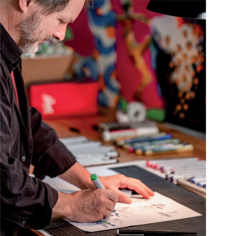
Andreas H. Gratze: Exactly, and they get scanned once they’re done. I use coloured markers and pens on separate pieces of paper for the bits I don’t want in monochrome. Those get scanned as well, and everything comes together on my computer screen. Sometimes I design separate patterns and structures to be filled into the designs later. Bringing all the parts together to make one design is more work than the sketching and designing itself due to all the intricate details.
The designs are as multi-layered as the chocolates themselves, which are built in layers as well.
Andreas H. Gratze: Yes, I like being playful. I incorporate little details to discover for people who take their time looking at the illustrations. The images may remind someone of a beautiful memory or tell them a story they respond to. Everyone has a different association, but the goal is to bring a smile to people’s faces.
How important is art for our lives? What is art capable of – your art in particular?
Andreas H. Gratze: Art is essential for the soul and spirit, and also for our freedom. Our freedom of thought, specifically. Art lives in contrast to our mundane, everyday lives. Art is also a distraction. My art is more adjacent to entertainment, but it is a bit more than just cute little pictures. Art should also be challenging. It is supposed to inspire and provoke thought. I’m sure that it helps prevent dementia as well (laughs). The illustrations are small-format pieces of art with an added bonus of free chocolate (laughs).
At the moment, DALL-E is being talked about quite a bit – the software program that can create images. What is the meaning of art in times of AI?
Andreas H. Gratze: I think artists won’t ever stop making art, what else are they supposed to do? AI is a tool, and it depends on who wields it. AI doesn’t exist in a vacuum, randomly deciding to paint pictures. Someone uses it to create what they want to create. I assume that artists will suck all the potential out of AI and produce surprising works of art. It was a similar situation in music when the synthesiser popped up. Many used it, and some musicians created truly great music with it.
Do you work with a team?
Andreas H. Gratze: No, but for the Christmas run, I’ve asked for my son Anouk’s support, who is also a graphic designer and who has created the bonbon advent tree and one of the elf chocolates. That made things easier for me, and of course I’m immensely proud of him.
You’ve been working with Sepp for almost 30 years, and in the past few years you’ve also cooperated with Julia. What’s that like?
Andreas H. Gratze: Julia represents the new generation and is of course completely different in the way she works. Sepp is a fast decision maker, very spontaneous and impulsive. Julia takes her time, she looks at things more closely and acknowledges and remembers every single detail of an image.
You master several different styles, you’re kind of a design chameleon that way. That’s also what still stumps DALL-E when it’s supposed to imitate Zotter or Gratze.
Andreas H. Gratze: Yes, because I only decide on a style when I’ve got the ingredients, the flavour and my sketches in view. Looking back, there are of course pieces of my work, in which I can recognise the styles from very specific time periods. Also, different chocolates require different styles as well – the Choco Lollies for example ask for cute and cheeky illustrations like a banana tiger – meaning a tiger in the shape of a banana. The Labookos focus on the character of the chocolate itself, so I chose characters defined by their provenance. The Cheery & Nuts range is split into two parts with colours and fruit as a focus and a few playful bits and pieces around them.
When I designed the Zotter logo, the initial idea was to put the logo at the top and a black frame with nothing but white on the inside underneath, so anything could be put in it, just like Zotter does with his chocolates when he experiments and substitutes 100 different things. The background is always white, so all new things can be featured over and over.
